By English Test Coach · Updated
Original questions · practical guidance
IELTS Academic Writing Task 1
Learn to turn a visual into a clear report. Work with original charts, tables, maps and process diagrams, with the source image, planning notes and a sample answer alongside each question.
Aim for at least 150 words in about 20 minutes. These are original teaching tasks, not recalled exam questions or predictions.
Academic vs General Training writing: compare the tasks and choose the right practice format.
Word count and revision: develop a short response or trim repetition while keeping the information the task needs.
Choose a visual and a worked example
Start with the source in your question. Each link explains a useful reporting decision and connects to an original practice task.
- Bar charts: compare categories and distinguish a single-year snapshot from a change over time.
- Line graphs: select trends, changing rankings and appropriately rounded figures.
- Tables: read across rows and columns, keeping shares distinct from headcounts.
- Pie charts: group changing shares and combine categories from the same year.
- Mixed visuals: cover both the journey chart and fare table without mixing their units.
- Maps and plans: distinguish completed changes from a proposed redevelopment.
- Process diagrams: follow the paper-making stages and distinguish a bottle-return loop from its recycling exit.
Find the overall picture first
For a chart, look for the biggest differences, trends and changes in ranking. For a map, identify major changes and what stays the same. For a process, identify its start, end and whether it is a sequence or a cycle. Use these observations to build your overview.
Group details instead of listing everything
Compare related categories or time periods in the same paragraph. Choose figures that support the main features, and keep units and dates accurate. With maps and processes, group connected locations or stages so the reader can follow the source.
Report only what the visual supports
A rising percentage does not prove that an absolute total increased. A proposed map does not show completed construction. Avoid adding reasons, opinions or benefits unless the task itself supplies them. Check each comparison against the original image.
How to write an overview: four worked visual examples
Choose a visual type, examine the original source, then compare the overview with the supporting detail. These short extracts demonstrate selection and organisation; use the linked annotated samples to study complete reports.
Charts and tables: compare the pattern before the figures
For a grid of figures, use the worked table-report guide to compare towns and years, distinguish shares from counts, and separate the largest category from a majority.
Read the source
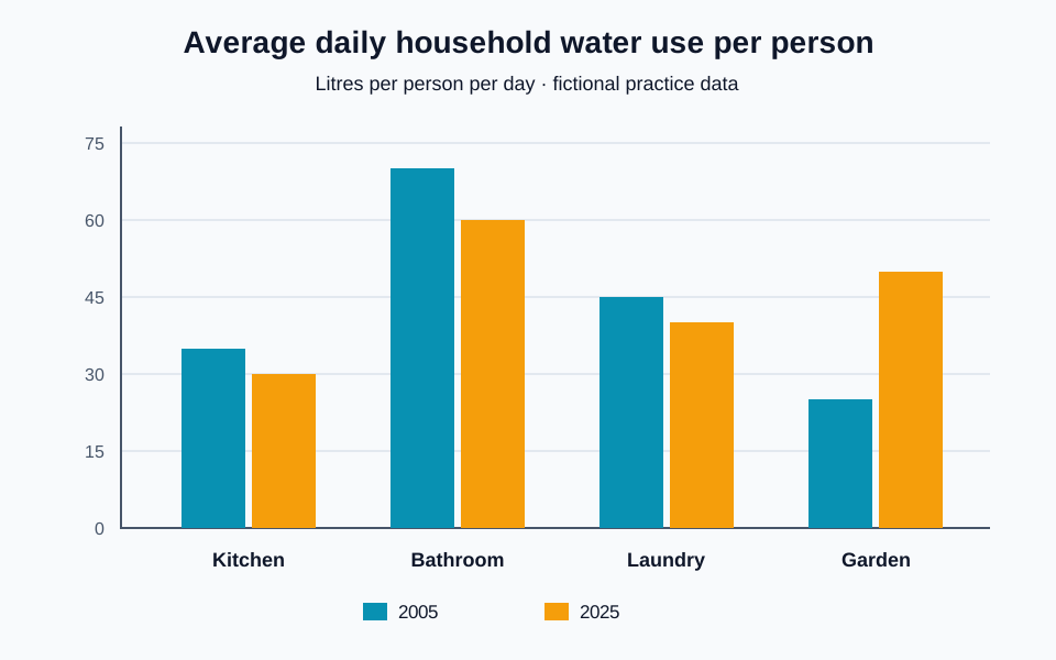
Check the unit before describing a change: this bar chart measures litres per person per day, not percentages or the town’s total consumption. It compares two years. Most categories fall, but garden use moves in the opposite direction.
One possible overview
Overall, bathrooms remained the largest source of water use per person, while gardens were the only category to increase and moved into second place by 2025.
Supporting detail
Garden water use doubled from 25 to 50 litres per person per day. In contrast, bathroom use fell from 70 to 60 litres, although it remained the largest category.
Why the comparison works
The overview selects a dominant category and the main exception. The detail connects two categories, supplies the years’ figures and preserves the unit. You can then group the smaller declines in kitchen and laundry use in another paragraph, rather than writing one unrelated sentence per bar.
Keep the report accurate
‘Water use fell everywhere’ misses the garden exception. ‘People watered gardens more because summers became hotter’ invents a cause. The chart shows how the figures differ, not why. A fall of 10 litres is also not a fall of 10 percent.
Apply the method to another visual
For a table, compare rows and columns to find patterns rather than transcribing each cell. For pie charts, distinguish percentage points from relative changes. If two visuals use different units, compare what each shows without treating a fare as a passenger count.
Multiple charts: cover both visuals without mixing their units
Read the source
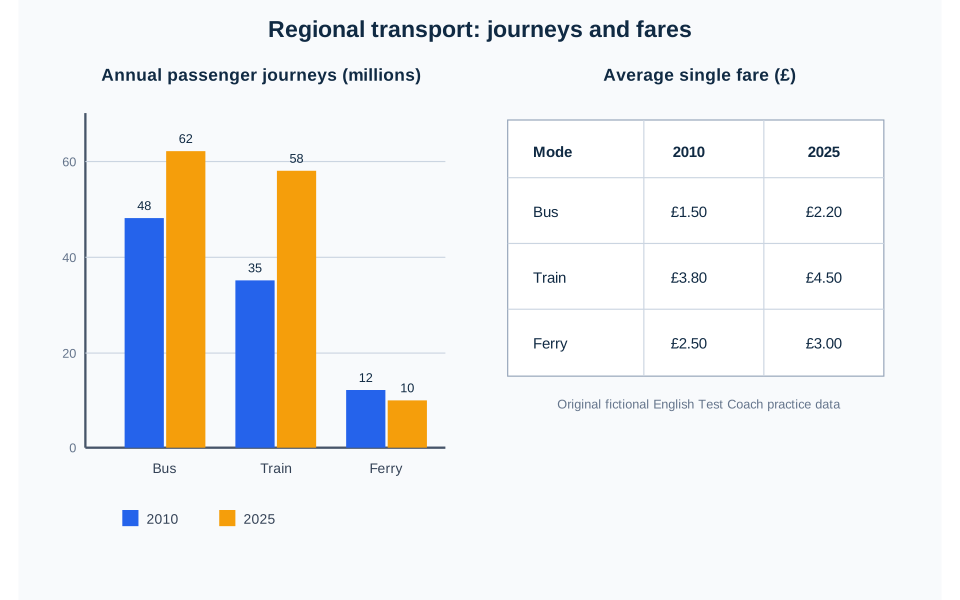
The bar chart counts annual passenger journeys in millions; the table gives the average single fare in pounds. Both compare bus, train and ferry travel in 2010 and 2025. Journeys are trips, not unique people. Find the main pattern in each visual before deciding how to connect them.
One possible overview
Overall, bus and train journeys increased while ferry use declined. All three fares rose, with trains remaining the most expensive mode and buses the cheapest.
Supporting detail
Train journeys rose from 35 million to 58 million, narrowing the gap with buses from 13 million to 4 million. Over the same period, both bus and train fares increased by £0.70, reaching £2.20 and £4.50 respectively.
Why the comparison works
The overview includes the journey trends and the fare pattern, so neither source disappears from the report. The detail first compares two journey totals, then compares their fares. ‘Over the same period’ connects the dates without claiming that one change caused the other. A full report should also develop the ferry figures.
Keep the report accurate
The identical £0.70 increases are not identical percentage rises: the starting fares differ. Do not call 58 million journeys ‘58 million passengers’, calculate revenue from an average fare as if it were the price of every ticket, or claim higher fares caused the fall in ferry journeys. These sources do not establish those conclusions.
Apply the method to another visual
A practical plan is one introduction naming both sources, an overview covering both, then a paragraph comparing journeys and another comparing fares. That is an option for this source, not a compulsory template. If another pair of visuals uses different dates or categories, check those limits before making a direct comparison.
Maps and plans: group changes and identify what remains
Use the complete map-writing guide for readable source tables, grouping, supported directions and a comparison with a proposed redevelopment.
Read the source
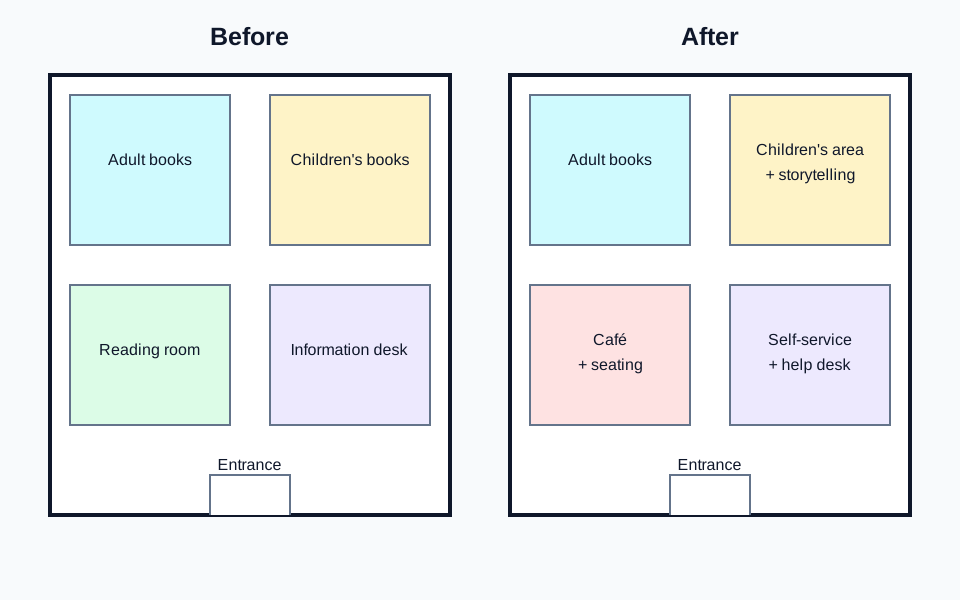
Compare the two plans by location and function. Here the entrance and adult-book area stay in place, while the reading, children’s and service areas change. There is no compass, so use positions such as left and right rather than assuming north.
One possible overview
Overall, the library added social and self-service facilities while retaining the entrance and adult-book area in their original positions.
Supporting detail
On the left of the plan, the adult-book area remained in the upper corner, while the reading room below it was replaced by a café with seating. On the right, the children’s area gained storytelling space and the information desk became a self-service area with a help desk.
Why the comparison works
Grouping the left-hand changes and then the right-hand changes gives the reader a route through the plan. The unchanged features help establish the extent of the redevelopment. ‘Was replaced by’ describes the change more precisely than calling every feature new.
Keep the report accurate
The plan does not show that the library became more popular or that visitors preferred the café. Those are evaluations, not visible features. Do not say the whole building was rebuilt when the source shows internal changes.
Apply the method to another visual
A proposed plan needs different tense: ‘the car park would be replaced’ or ‘is planned to be replaced’, rather than ‘was replaced’. Our station-square task includes a north arrow and a proposed 2028 design, so compass directions are supported there.
Processes: follow the arrows and explain the main phases
Read the source
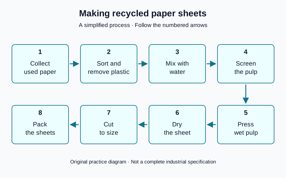
This simplified diagram has eight numbered stages. Its upper row runs left to right, and its lower row runs right to left. It starts with used paper and ends with packed sheets; no arrow returns the finished product to the start.
One possible overview
Overall, this is a linear process in which used paper is prepared and turned into pulp before being formed into dry sheets and packaged.
Supporting detail
After collection, the used paper is sorted to remove plastic and mixed with water. The resulting pulp is screened before being pressed. The sheet is then dried, cut to size and packed.
Why the comparison works
The overview groups the preparation, production and finishing phases. The detail follows every major stage in order without making each sentence start with ‘then’. Passive verbs suit the focus on materials here, but passive voice is a tool, not a rule that every sentence must follow.
Keep the report accurate
Do not call every recycling diagram a cycle. This source has no return loop. It also gives no temperature, chemicals or processing time, so adding hot water, bleach or a drying duration would introduce unsupported details.
Apply the method to another visual
Contrast this with the returnable-bottle diagram: customers return bottles to collection, making a loop. Damaged bottles leave at inspection for glass recycling. A useful report must describe both the main cycle and that separate exit rather than claiming all bottles are reused.
Compare charts when the category labels change
Two charts can each total 100% without using the same breakdown. In our original electricity-generation task, 1995 has six source labels and 2025 has five. Match the labels before calculating changes; similar-looking categories are not automatically equivalent.
Inspect the electricity chart and question, or open its readable figures below.
Read the chart data as a table
These figures belong to the original English Test Coach practice visual. They are fictional teaching data, not measured statistics about real places.
| Source as labelled | Share (%) |
|---|---|
| Coal | 35 |
| Gas | 20 |
| Nuclear | 15 |
| Hydro | 5 |
| Other | 5 |
| Oil | 20 |
| Total | 100 |
| Source as labelled | Share (%) |
|---|---|
| Coal | 15 |
| Gas | 10 |
| Nuclear | 30 |
| Renewables | 25 |
| Other sources | 20 |
| Total | 100 |
Both bars include the complete 100% mix, including oil at 20% in 1995 and other sources at 20% in 2025. The categories differ: 1995 labels hydro separately, while 2025 uses renewables and other sources. Do not assume an unlisted source fell to zero or treat these labels as an exact like-for-like breakdown. Percentages alone do not show the total amount of electricity generated.
Compare the unchanged labels
Coal, gas and nuclear appear in both years. Coal’s share fell from 35% to 15%, a decrease of 20 percentage points. Gas’s share halved from 20% to 10%, while nuclear’s doubled from 15% to 30%.
One possible overview is: “Overall, nuclear replaced coal as the largest labelled source of electricity, while both coal and gas accounted for smaller shares in 2025.” This compares the supported pattern without inventing a history for the regrouped sources.
Describe changed groupings separately
Hydro is labelled at 5% in 1995; renewables account for 25% in 2025. These are different categories, so that is not evidence of a fivefold rise in hydro. Oil has a separate 20% label only in 1995: its absence as a separate label in 2025 does not establish zero use.
Likewise, “Other” at 5% and “Other sources” at 20% do not identify their members. Report the displayed shares if useful, but do not claim that one unchanged group quadrupled. None of these percentages establishes a change in the total amount of electricity generated.
Repair two unsupported comparisons
First diagnose the problem, then rewrite the sentence using only the chart evidence.
1. “Hydro rose fivefold to 25%, and oil disappeared.”
The sentence equates hydro with all renewables and treats an unlisted label as zero. A supported replacement is: “Hydro represented 5% in 1995, while the broader renewables category accounted for 25% in 2025. Oil was separately labelled at 20% in 1995 but was not shown separately in 2025.”
2. “Nuclear output doubled, whereas coal fell by 20%.”
The charts show shares, not absolute output, and 35% to 15% is a fall of 20 percentage points. A supported replacement is: “Nuclear’s share doubled from 15% to 30%, whereas coal’s share fell by 20 percentage points, from 35% to 15%.”
For another source, check the legend and any definitions before merging categories. Keep valid direct comparisons, state each differently grouped figure precisely, and leave unknown mappings unknown.
Turn the example into your own report
- Identify the source type, labels, units and dates before drafting.
- Write an overview of the main pattern, changes or phases.
- Group supporting details so each paragraph has a clear focus.
- Check every number, location and stage against the visual.
For a focused exercise, try the visual-data lesson or the maps and processes lesson. These approaches explain how to read the source; they do not guarantee a band score.
13 original questions
Choose what to practise
Each question has its own planning ideas, vocabulary in context and a complete annotated sample. Try writing first, then compare the approach.
Natural cycle
- Question & guidance
Processes and stages
A simplified coastal water cycle
The diagram shows selected routes in a simplified coastal water cycle. Summarise the information by selecting and reporting the main features, and make comparisons where relevant.
Line chart
- Question & guidance
Charts and data
Library loans: observations and forecasts
The line graph shows annual loans of print books and digital items from a town's libraries in 2020 and 2025, with projections for 2030 and 2035. Summarise the information by selecting and reporting the main features, and make comparisons where relevant.
- Question & guidance
Charts and data
Museum visitor trends
The line graph shows the number of visitors to three museums between 2000 and 2020. Summarise the information by selecting and reporting the main features, and make comparisons where relevant.
Bar chart
- Question & guidance
Charts and data
Evening class enrolments
The bar chart shows enrolments in six types of evening class at a community centre in 2025. Summarise the information by selecting and reporting the main features, and make comparisons where relevant.
- Question & guidance
Charts and data
Household water use
The bar chart shows average daily household water use per person for four purposes in a town in 2005 and 2025. Summarise the information by selecting and reporting the main features, and make comparisons where relevant.
Stacked charts
- Question & guidance
Charts and data
Electricity generation
The charts compare the sources used to generate electricity in a country in 1995 and 2025. Summarise the information by selecting and reporting the main features, and make comparisons where relevant.
Maps
- Question & guidance
Maps and plans
Library redevelopment
The maps show a public library before and after redevelopment. Summarise the information by selecting and reporting the main features, and make comparisons where relevant.
Table
- Question & guidance
Charts and data
How people travel to work
The table shows the percentages of commuters using three main methods of travel to work in three towns in 2010 and 2025. Summarise the information by selecting and reporting the main features, and make comparisons where relevant.
Process diagram
- Question & guidance
Processes and stages
Making recycled paper sheets
The diagram shows a simplified process for making recycled paper sheets from used paper. Summarise the information by selecting and reporting the main features, and make comparisons where relevant.
Pie charts
- Question & guidance
Charts and data
Household spending shares
The pie charts compare how an average household in a town distributed its monthly spending among five categories in 2005 and 2025. Summarise the information by selecting and reporting the main features, and make comparisons where relevant.
Multiple charts
- Question & guidance
Charts and data
Passenger journeys and fares
The bar chart shows annual passenger journeys by three forms of regional transport in 2010 and 2025, while the table gives the average single fare for each form in the same years. Summarise the information by selecting and reporting the main features, and make comparisons where relevant.
Cyclical process
- Question & guidance
Processes and stages
A returnable bottle system
The diagram shows a simplified system for collecting and reusing glass bottles. Summarise the information by selecting and reporting the main features, and make comparisons where relevant.
Proposed maps
- Question & guidance
Maps and plans
A proposed station square
The plans show a station square in 2025 and a proposed design for the same area in 2028. Summarise the information by selecting and reporting the main features, and make comparisons where relevant.
Before you finish
- Is there a clear overview of the main features?
- Have I selected useful comparisons rather than every detail?
- Are figures, units, locations and sequence accurate?
- Have I avoided unsupported causes and opinions?
Turn reading into writing
Choose a question above to open a ready-to-use writing workspace. The original questions, samples and planning tools are free to explore without an account. AI assessment is not currently publicly enabled.
Open the writing checker →