By English Test Coach · Updated
Academic Task 1 · Parts of a whole and changes in share
IELTS pie charts: compare the distribution, not just the slices
First identify what the whole pie represents. Then select the largest categories, important changes and useful combinations. A clear report explains how the distribution differs without inventing a total that the charts do not provide.
The fictional household-spending charts, worked extracts and annotated report below are original English Test Coach teaching material. They are not recalled exam questions or examiner-scored answers.
Identify the whole, categories and dates
Original question: household spending
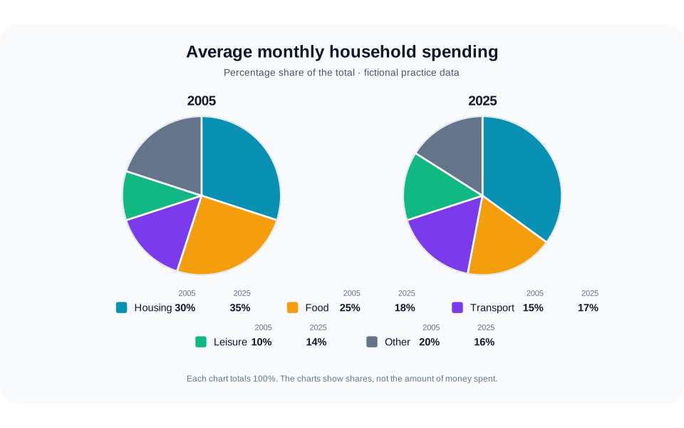
The pie charts compare how an average household in a town distributed its monthly spending among five categories in 2005 and 2025. Summarise the information by selecting and reporting the main features, and make comparisons where relevant.
Read the chart data as a table
These figures belong to the original English Test Coach practice visual. They are fictional teaching data, not measured statistics about real places.
| Category | 2005 | 2025 |
|---|---|---|
| Housing | 30 | 35 |
| Food | 25 | 18 |
| Transport | 15 | 17 |
| Leisure | 10 | 14 |
| Other | 20 | 16 |
| Total share | 100 | 100 |
Each year totals 100%. The charts give shares, not amounts of money: a larger slice does not establish higher actual expenditure. Housing and food together account for 55% in 2005 and 53% in 2025.
- Whole: average monthly household spending in each year.
- Measure: percentage shares of that total, not a currency amount.
- Dates: 2005 and 2025. Two years support endpoint comparisons, but do not show every intervening year.
- Categories: housing, food, transport, leisure and other spending. The same five labels appear in both charts.
Use the legend and printed values together. Each pie totals 100%, but equal-sized circles do not establish equal spending budgets. The graphic normalises each year to a whole.
When a different question compares places at one date, describe differences between places rather than changes over time. Let the labels determine the comparison.
Distinguish the largest share from the largest change
Housing is the largest category in both years: 30% initially and 35% later. Food has the largest percentage-point decrease, moving from 25% to 18%. Transport and leisure gain share, while other spending loses share.
One possible overview
“Overall, housing remained the largest component of household spending and took a greater share in 2025. Food and other spending accounted for smaller proportions, whereas transport and leisure became more prominent.”
The overview identifies a dominant category and groups the directions of change. The detail paragraphs can quantify those movements and show that housing and food together remain just over half of the total. You do not need to put every percentage into the overview.
Avoid “households spent more on housing” if you mean a larger share: the actual money spent is unknown. “Housing took a larger proportion of the budget” preserves the measure shown.
Choose a grouping that creates comparisons
Option 1: two leading categories, then the smaller shares
Compare housing and food first. They are the two largest categories in both years, but move in opposite directions. Their combined share falls slightly from 55% to 53%.
Then group transport, leisure and other spending. The first two rise, while the last falls. This is the structure used in the full sample.
Option 2: rising shares, then falling shares
Group housing, transport and leisure as increases, then compare the decreases in food and other spending. Keep the overall ranking visible so the paragraph does more than list changes.
This can also work, but avoid duplicating the same figures in several paragraphs. Choose one plan and develop its comparisons consistently.
Explain the combined share
“Housing and food together represented 55% of spending in 2005 and 53% in 2025. Their combined share edged down because food’s seven-percentage-point fall was larger than housing’s five-point rise.”
Here “because” explains the arithmetic relationship visible in the charts. It does not invent an economic cause. Claiming that food’s share fell because households changed their diets would introduce information the charts do not contain.
Read the complete household-spending report and annotations to see how the introduction, overview and two detail paragraphs fit together.
Make comparisons with the correct base
Add categories within the same year
Housing plus food is 30% + 25% = 55% in 2005, and 35% + 18% = 53% in 2025. Each sum combines separate categories from one whole. Adding 2005 housing to 2025 food would mix two different distributions and would not describe either year’s combined share.
Separate percentage points from relative change
Leisure rises from 10% to 14%: an increase of four percentage points. Relative to its starting share, that is a 40% increase, because 4 ÷ 10 × 100 = 40. It is not an increase of four percent.
For most sentences, the two values and “percentage points” are enough. You do not need a series of calculated growth rates. Use “accounted for”, “made up” or “represented” to connect a category to its share: “Transport accounted for 17% of spending in 2025.”
Do not turn a changing share into a money amount
No total budget or currency is supplied. A rise from 30% to 35% cannot prove that housing expenditure increased by a particular amount, or even that the amount increased at all. The result depends on the size of the whole budget in each year.
Likewise, “Other spending” is a single category in this source. Do not divide it into named purchases or give reasons for its decline. If another source changes its category labels between years, check whether they remain comparable; the electricity-generation question illustrates why that extra check matters.
Check an overview and its supporting figures
- Write a two-sentence overview that names the dominant category and groups rising and falling shares.
- How much did the food share fall, in percentage points?
- Did housing and food together become a larger or smaller part of the budget?
- What is wrong with “Leisure spending increased by four pounds”?
Compare the reasoning
Food falls by seven percentage points, from 25% to 18%. Housing and food together fall by two points, from 55% to 53%, while remaining more than half of the total. Leisure’s share rises by four percentage points; there is no currency or total budget to support a four-pound increase.
- Does the overview describe the whole distribution?
- Have you kept each category matched to the correct year?
- Are combined shares taken from the same pie?
- Do you distinguish a percentage-point difference from a relative change?
- Have you avoided unsupported amounts, purchases and causes?
For more practice with proportions, use the commuting-table guide. The visual-data lesson offers another short overview exercise.
Write a report from the original pie charts
Plan an overview and grouped detail, then draft at least 150 words in about 20 minutes. Public AI assessment is paused; the free workspace provides the planner, timer and word count without an account. The rule-based demo is not an AI score.