By English Test Coach · Updated
All sample answersAcademic Task 1 · 207 words
Household spending: compare changing shares
Select the largest categories and changes while distinguishing percentage shares from unknown amounts of money.
Study the method: Pie charts: compare distributions and changing shares →
Band 7 goal: Data comparisons
Develop and connect relevant ideas or select and compare the most useful details. This is a study route, not an examiner score assigned to the answer. How IELTS Writing is assessed.
The question
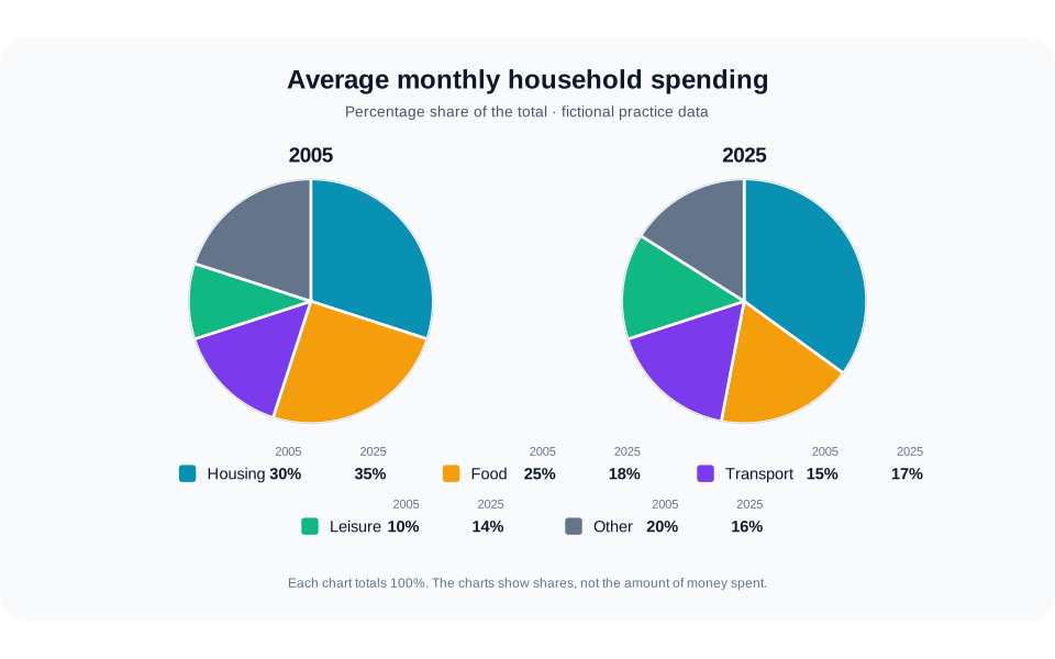
The pie charts compare how an average household in a town distributed its monthly spending among five categories in 2005 and 2025. Summarise the information by selecting and reporting the main features, and make comparisons where relevant.
 Open full-size diagram (new tab)
Read the chart data as a table
These figures belong to the original English Test Coach practice visual. They are fictional teaching data, not measured statistics about real places.
| Category | 2005 | 2025 |
|---|---|---|
| Housing | 30 | 35 |
| Food | 25 | 18 |
| Transport | 15 | 17 |
| Leisure | 10 | 14 |
| Other | 20 | 16 |
| Total share | 100 | 100 |
Each year totals 100%. The charts give shares, not amounts of money: a larger slice does not establish higher actual expenditure. Housing and food together account for 55% in 2005 and 53% in 2025.
The sample answer
The two pie charts compare the percentage distribution of average monthly household spending across housing, food, transport, leisure and other items in a fictional town in 2005 and 2025.
Overall, housing accounted for the largest share in both years and became more prominent by 2025, whereas food experienced the greatest decline. Transport and leisure both gained modest shares, while the proportion assigned to other spending also fell. Housing and food together still represented more than half of the budget in each year.
In 2005, housing made up 30% of household spending, five percentage points more than food at 25%. Twenty years later, the housing figure had risen by five points to 35%. Food moved in the opposite direction, dropping seven points to 18%. Their combined share therefore decreased slightly, from 55% to 53%, despite housing taking a larger part of the total.
The three smaller categories showed less dramatic changes. Transport accounted for 15% in 2005 and edged up to 17% in 2025, while leisure rose from 10% to 14%. By contrast, other expenditure declined from one fifth of the total to 16%. As the charts provide proportions only, these movements do not establish whether households spent more or less money on any category in absolute terms.
Vocabulary in context
Each phrase appears in the answer above. Learn how it works, not just a replacement word.
- accounted for
- Constituted or made up a stated part of a complete total.
Use it with a category and share: housing accounted for 35%, not housing accounted 35%.
- percentage points
- The arithmetic difference between two percentages rather than a relative percentage change.
A move from 30% to 35% is an increase of five percentage points.
- combined share
- The total proportion obtained by adding two or more categories together.
Name the categories being combined and check that their percentages come from the same year.
Now make it your own
Write a two-sentence overview without numbers, then compare food with the three smaller 2025 categories. Explain why the charts cannot prove that actual housing costs increased.
For a smaller practice step, use the explanation, knowledge check and self-review exercise in Select and compare visual information.
The practice link opens the original question, not a copy of this answer.
Open the writing workspaceMore examples of this question type
Give an overview of the main patterns and support selected comparisons with accurate figures and units.