By English Test Coach · Updated
Academic Task 1 · Charts and data
Electricity generation
An original IELTS practice question with a planning route and a sample answer to learn from.
Aim for at least 150 words in about 20 minutes. Suggested practice level: intermediate, not a predicted band.
Your writing task
The charts compare the sources used to generate electricity in a country in 1995 and 2025. Summarise the information by selecting and reporting the main features, and make comparisons where relevant.
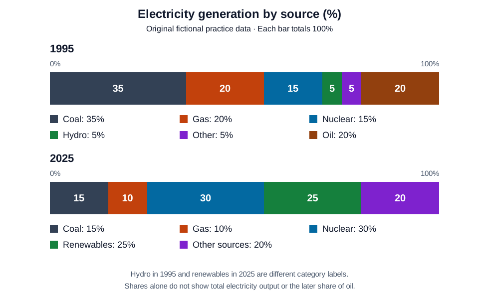 Open full-size diagram (new tab)
Read the chart data as a table
These figures belong to the original English Test Coach practice visual. They are fictional teaching data, not measured statistics about real places.
| Source as labelled | Share (%) |
|---|---|
| Coal | 35 |
| Gas | 20 |
| Nuclear | 15 |
| Hydro | 5 |
| Other | 5 |
| Oil | 20 |
| Total | 100 |
| Source as labelled | Share (%) |
|---|---|
| Coal | 15 |
| Gas | 10 |
| Nuclear | 30 |
| Renewables | 25 |
| Other sources | 20 |
| Total | 100 |
Both bars include the complete 100% mix, including oil at 20% in 1995 and other sources at 20% in 2025. The categories differ: 1995 labels hydro separately, while 2025 uses renewables and other sources. Do not assume an unlisted source fell to zero or treat these labels as an exact like-for-like breakdown. Percentages alone do not show the total amount of electricity generated.
How to approach this question
Give an overview of the main patterns and support selected comparisons with accurate figures and units.
Charts and tables: build an overview and compare details →
Worked example: Compare electricity shares when category labels change →
Overview selection: identify the largest sources in each year and the main change in the mix. Check whether the chart shows percentages or absolute quantities.
Detail grouping: compare sources that increased with those that decreased, using figures from the chart. Do not infer total electricity production from percentage shares alone.
These are possible directions, not required opinions or facts to memorise. Develop your own response and check every claim against the task.
A possible plan
- Introduction: identify what is shown, including the time period or stages where relevant.
- Overview: select the largest changes, main contrasts or overall process without inventing causes.
- Details 1: group related features and support them with accurate data, locations or stages.
- Details 2: cover the remaining main features and make relevant comparisons. Check units, dates and direction of change.
Vocabulary you can use precisely
Choose language that fits your meaning. You do not need to include every phrase.
- accounted for
- Made up a specified part of a total.
Use 'Coal accounted for ...' with the actual share shown in the chart.
- percentage points
- The arithmetic difference between two percentages.
A change from 20% to 30% is an increase of 10 percentage points, not 10%.
Ready to write your own answer?
The workspace opens with this question selected, not the sample answer. Plan, write and review your own response. Public AI assessments are currently paused; the writing and study tools remain available.
Start this writing task →