By English Test Coach · Updated
Academic Task 1 · Reading rows, columns and units
IELTS table reports: turn a grid of figures into comparisons
A table gives every cell equal visual weight. Your report should select the patterns that matter. Check what each row represents, compare related values and use the units to decide what you can safely conclude.
This guide uses an original fictional commuting table and its annotated sample report. The examples are teaching material, not recalled test data or an examiner-scored answer.
Read the table in two directions
Original question: commuting methods
The table shows the percentages of commuters using three main methods of travel to work in three towns in 2010 and 2025. Summarise the information by selecting and reporting the main features, and make comparisons where relevant.
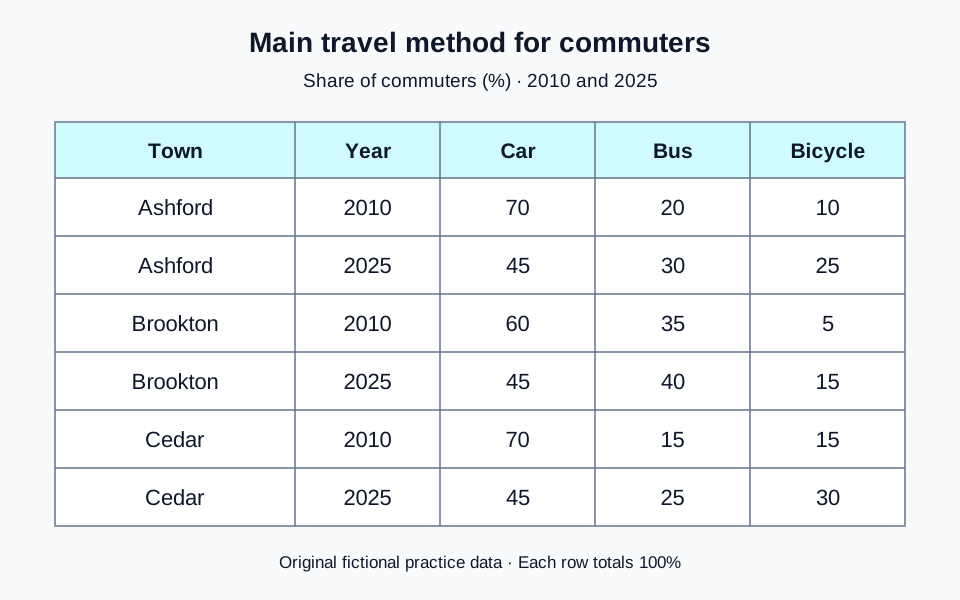
Read the chart data as a table
These figures belong to the original English Test Coach practice visual. They are fictional teaching data, not measured statistics about real places.
| Town and year | Car | Bus | Bicycle |
|---|---|---|---|
| Ashford, 2010 | 70 | 20 | 10 |
| Ashford, 2025 | 45 | 30 | 25 |
| Brookton, 2010 | 60 | 35 | 5 |
| Brookton, 2025 | 45 | 40 | 15 |
| Cedar, 2010 | 70 | 15 | 15 |
| Cedar, 2025 | 45 | 25 | 30 |
Each town-year row totals 100%. These are proportions of commuters, so they do not establish how many people travelled by each method. A change from 70% to 45% is a fall of 25 percentage points.
Each row is a distribution of commuters in one town in one year. Car, bus and bicycle shares total 100% within that row. The figures are percentages of commuters, not journey times, distances or headcounts.
1. Compare methods within the same year
In Ashford in 2025, car use is 45%, bus use 30% and cycling 25%. Cars are the largest individual category. Do the same check for the other towns before deciding whether the pattern is shared.
Then compare one method across towns: all three car shares are 45% in 2025, but bus and bicycle shares differ.
2. Compare the same category across years
Keep town and method fixed while changing the date. Ashford’s car share falls from 70% in 2010 to 45% in 2025. Brookton’s falls from 60% to 45%, so the final shares match even though their starting points and decreases differ.
Do not compare Ashford’s car figure in 2010 with Cedar’s bus figure in 2025 and call the difference a trend. More than one dimension has changed.
Select a common trend and a useful final comparison
One possible overview
“Overall, the proportion of commuters using cars decreased in every town, while bus and bicycle shares rose. Cars nevertheless remained the largest individual category in 2025, with the same share in all three towns.”
This overview covers the direction of change, the final ranking and the matching endpoints. The detail paragraphs can show which town changed most and where the other methods differed. Listing all eighteen numbers in the overview would obscure those relationships.
Largest category does not always mean majority
A majority is more than half. The car share is 45% in each town in 2025, so it is not a majority. It is larger than either bus or bicycle use separately. Together, those two alternatives account for 55%.
“Most commuters travelled by car” is therefore a risky description if it implies more than half. “Cars were the most common individual method” states the supported ranking more precisely.
Two observations do not show every intervening year
The table shows an endpoint decrease between 2010 and 2025. It does not establish that car use fell steadily every year or when the change happened. Avoid adding “continuously”, a turning point or a policy explanation that the table does not supply.
Group the detail around relationships
One workable plan is to compare car and bus shares first, then use a second detail paragraph for cycling. That lets you group matching values and bring out contrasts without writing three repetitive mini-reports.
- Cars: Ashford and Cedar both fall from 70% to 45%; Brookton starts lower at 60% and reaches the same endpoint.
- Buses: Brookton has the highest share in both years, rising from 35% to 40%. Ashford and Cedar each gain ten percentage points, ending at 30% and 25% respectively.
- Bicycles: all shares rise, but distinguish the size of the proportional change from the final ranking. Brookton triples from 5% to 15% and still has the smallest cycling share in 2025.
A comparison that needs both a change and an endpoint
“Brookton’s cycling share tripled, from 5% to 15%, but remained below Ashford’s 25% and Cedar’s 30% in 2025.”
The contrast prevents “tripled” from being mistaken for “became the largest”. Read the complete commuting report and paragraph annotations to see the introduction, overview and grouped detail together. This is one coherent plan, not a mandatory paragraph formula for every table.
Keep shares, changes and totals separate
Percentage points measure the gap between percentages
Ashford’s bus share rises from 20% to 30%. The difference is 10 percentage points: 30 − 20 = 10. The relative increase is 50%: (30 − 20) ÷ 20 × 100 = 50. “Rose by 10%” would describe a different calculation.
You do not need to compute relative changes for every cell. Stating the starting and finishing shares accurately is often clearer. If you choose “doubled” or “tripled”, check the ratio: Cedar’s cycling share doubles from 15% to 30%, while Brookton’s triples from 5% to 15%.
Equal shares do not establish equal numbers of people
The 45% car share in each town does not mean the same number of people drove. The total numbers of commuters may differ, and the table does not give them. Likewise, a falling share alone does not establish a falling headcount if the underlying population changes.
A separate arithmetic illustration
If one group contained 100 people, 45% would represent 45 people. If another contained 200, the same 45% would represent 90. These invented group sizes are only an explanation of percentages; they are not additional data for the commuting report.
Do not add percentages from different populations
Adding the three 45% car shares gives 135%, which is not a combined commuting share. Each percentage has a different town as its base. For differing bus or bicycle shares, a simple average across towns is not necessarily the share of all commuters: the table supplies no population weights. Compare the towns directly instead of inventing an overall total.
Keep the measure visible in your wording: “the share using buses” is safer than “the number of bus passengers” when only percentages are supplied.
Revise three unsupported statements
- “A majority of commuters used cars in every town in 2025.”
- “Brookton had the highest cycling share because its figure tripled.”
- “The number of car commuters in Ashford fell steadily each year.”
Compare supported revisions
1. Cars were the largest individual category in each town, at 45%, but represented less than half of commuters.
2. Brookton’s cycling share tripled from 5% to 15%, yet remained the smallest in 2025; Cedar had the highest share at 30%.
3. Ashford’s car share fell from 70% in 2010 to 45% in 2025. Neither an absolute headcount decrease nor a steady yearly path is established.
- Have you matched the correct town, year and method?
- Does the overview select patterns instead of copying cells?
- Are percentage points and relative changes distinguished?
- Does “largest” refer to a ranking rather than an unsupported majority?
- Have you avoided invented population totals, intermediate trends and causes?
Use the visual-data lesson for a short exercise, or compare the line-graph example, which supplies observations at more than two dates. The single-year bar chart illustrates a different case: categories with no time trend to describe.
Write from the original table
Plan an overview and two connected detail paragraphs, then draft at least 150 words in about 20 minutes. Public AI assessment is paused; the free workspace provides the planner, timer and word count without an account. The rule-based demo is not an AI score.