By English Test Coach · Updated
Academic Task 1 · Read the labels before choosing verbs
IELTS bar charts: compare categories or describe change?
A shorter bar does not necessarily mean a fall. First check whether the chart compares categories at one time or shows the same categories across different dates. That decision shapes your overview, grouping and language.
This guide uses original fictional teaching data, with a complete practice question and annotated answer. The sample is a study example, not an examiner-scored response or a recalled IELTS question.
Read the title, units and dates
Original question: evening class enrolments
The bar chart shows enrolments in six types of evening class at a community centre in 2025. Summarise the information by selecting and reporting the main features, and make comparisons where relevant.
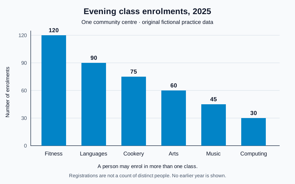
Read the chart data as a table
These figures belong to the original English Test Coach practice visual. They are fictional teaching data, not measured statistics about real places.
| Class type | Enrolments |
|---|---|
| Fitness | 120 |
| Languages | 90 |
| Cookery | 75 |
| Arts | 60 |
| Music | 45 |
| Computing | 30 |
| Total enrolments | 420 |
These are registrations, not distinct people: one person may enrol in several classes. The chart gives one year only, so it shows differences between categories, not changes over time.
- Subject: six types of evening class at one community centre.
- Measure: enrolments, not percentages or unique people. Someone can enrol in more than one class.
- Time: 2025 only. The chart cannot show what increased or decreased from an earlier year.
- Scale: the vertical axis starts at zero and each labelled interval represents 30 enrolments. Cookery and music fall halfway between labelled intervals.
A suitable introduction is: “The bar chart compares the number of enrolments in six types of evening class at a community centre in 2025.” You have identified what the figure measures without adding a trend.
Select the overall pattern before the supporting figures
One possible overview
“Overall, fitness and languages recorded the highest totals and together accounted for half of all enrolments. Computing had the smallest number, while the remaining categories occupied the middle of the range.”
This selects the leading categories, their combined significance and the lowest category. The calculation is straightforward: 120 + 90 = 210, out of 420 total enrolments. You can also write a clear overview without calculating a share; do not let optional arithmetic distract from the main pattern.
Avoid reading left to right as time
“Enrolments fell from 120 to 30” suggests a change in one quantity over time. The chart instead orders six different categories from largest to smallest.
Make the relationship explicit
“Fitness recorded four times as many enrolments as computing” compares 120 with 30 in the same year. “Computing had the fewest enrolments” states the ranking without implying a decline.
Higher enrolment does not by itself establish greater personal preference or better teaching: class capacity and availability are not supplied. Report the observed totals without inventing causes.
Group details around comparisons
A six-sentence list of isolated numbers makes the reader do the comparison. Use two connected groups, then choose figures that support the overview.
- First detail paragraph: start with fitness (120) and languages (90). Compare their gap of 30 with the smaller gap of 15 between cookery (75) and arts (60).
- Second detail paragraph: connect music (45) and computing (30). Their combined 75 equals cookery alone; arts has twice the computing total.
Turn a comparison into a sentence
“Music and computing recorded 45 and 30 enrolments respectively. Their combined total of 75 equalled cookery alone, while arts had twice as many registrations as computing.”
“Respectively” preserves the order: music → 45, computing → 30. “Their combined total” refers to those two categories, not all six. “Twice as many” expresses a ratio; “30 more” expresses a difference. Both work for arts versus computing, but they describe different relationships.
There is no requirement to calculate every possible ratio or include every small gap. Here, the selected relationships help explain the distribution. Read the complete original evening-classes report and paragraph notes to see the introduction, overview and detail together.
For grammar in these comparisons, try the subject–verb agreement exercise: a combined total takes a singular verb, while separate figures take a plural verb.
When two dates appear, describe change as well as ranking
The household-water bar chart gives figures for 2005 and 2025. It supports a different kind of statement: garden use doubled from 25 to 50 litres per person per day. The other three categories fell, while the combined daily figure edged up from 175 to 180 litres.
One-year enrolment chart
Use “higher than”, “recorded”, “accounted for” and “twice as many” to compare categories in 2025. A difference between bars is not evidence of growth.
Two-year water chart
Use “rose”, “fell” or “doubled” when comparing the same category across 2005 and 2025. Keep “litres per person per day”; the chart does not give total town water use.
Read the annotated household-water report and identify one ranking comparison and one change over time. If a task combines a bar chart and a table, inspect each measure separately: our regional transport question combines passenger journeys in millions with average single fares in pounds. Those units cannot be added together.
Try the comparisons before reading the answer
- Write a two-sentence overview of the enrolment chart without using “rose”, “fell” or “increased”.
- Which two smaller categories together equal cookery? Write the comparison with both figures.
- Explain why “420 people attended classes” goes beyond the data.
- Choose two groups for your detail paragraphs and explain why they help the reader.
Check the reasoning
Music and computing total 45 + 30 = 75 enrolments, equal to cookery. The six categories total 420 registrations, but one person may register for more than one class, so the number of distinct people is unknown. Several groupings can work: the larger and middle categories followed by the two smallest is one clear option. Check that your overview selects the main pattern rather than repeating every figure.
- Have you identified the correct unit and time period?
- Does your overview describe the main pattern?
- Do verbs distinguish a static comparison from a change?
- Can every number, ratio and total be checked against the chart?
- Have you avoided causes or preferences the visual does not establish?
The visual-data lesson adds practice with percentages and overview selection. The Task Achievement guidance explains why accurate selection matters.
Write your own bar-chart report
Open the original chart in the free workspace. Aim for at least 150 words in about 20 minutes, then compare your selection and accuracy with the annotated sample. Public AI assessment is paused; the planner, timer and word count remain available without an account. The rule-based demo is not an AI score.