By English Test Coach · Updated
Academic Task 1 · Trends, rankings and careful readings
IELTS line graphs: select the story the figures support
Read the period, units and legend before describing a trend. Then compare the main directions and changes in ranking, using selected figures to support the overview rather than turning every plotted point into a separate sentence.
This guide uses two original fictional charts: museum attendance over a past period and library loans with later projections. Both have complete annotated reports. They are teaching material, not recalled test questions or examiner-scored responses.
Identify the units and the observation intervals
Original question: museum visitor trends
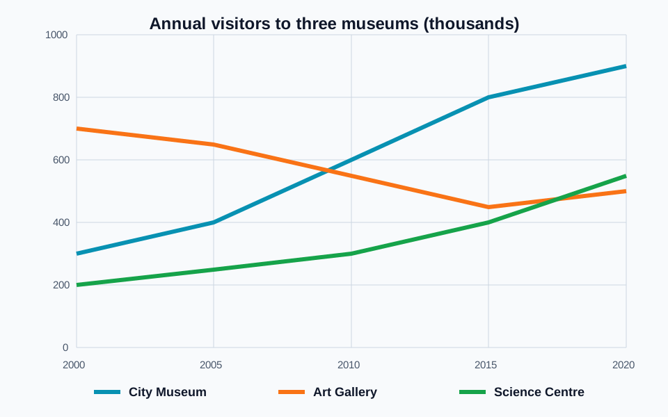
The line graph shows the number of visitors to three museums between 2000 and 2020. Summarise the information by selecting and reporting the main features, and make comparisons where relevant.
Read the chart data as a table
These figures belong to the original English Test Coach practice visual. They are fictional teaching data, not measured statistics about real places.
| Year | City Museum | Art Gallery | Science Centre |
|---|---|---|---|
| 2000 | 300 | 700 | 200 |
| 2005 | 400 | 650 | 250 |
| 2010 | 600 | 550 | 300 |
| 2015 | 800 | 450 | 400 |
| 2020 | 900 | 500 | 550 |
Readings are rounded to the nearest 50 thousand visitors from the graph. For example, 300 represents approximately 300,000 visitors. Compare the overall direction as well as the starting and ending figures.
- Measure: annual visitors, in thousands. A reading of 300 represents 300,000 visitors.
- Period: 2000 to 2020, with values shown at five-year intervals.
- Series: City Museum, Art Gallery and Science Centre. Match each coloured line to the legend.
- Precision: use sensible rounded readings where a line sits between labelled grid values. The readable table rounds to the nearest 50 thousand.
An introduction can simply identify the three venues, measure and period. Save the main comparisons for the overview and detail; you do not need to speculate about tourism, ticket prices or exhibitions.
Choose trends and ranking changes for the overview
One possible overview
“Overall, visitor numbers rose at the City Museum and Science Centre, while the Art Gallery finished below its starting level despite a late recovery. The gallery had the highest attendance initially, but the City Museum led by the end of the period.”
The first sentence compares directions across all three series. The second selects a change in ranking. Together they cover the broad pattern without listing all fifteen readings.
Do not flatten an uneven pattern
“The Art Gallery’s attendance fell throughout” overlooks its rise from roughly 450,000 in 2015 to 500,000 in 2020. It declined overall, but not in every interval.
Distinguish endpoints from direction
“The Science Centre remained the least visited” is also inaccurate. It began below the other venues, but finished at approximately 550,000, slightly above the Art Gallery.
An overview does not need every turning point. Select features that help the reader understand the whole chart, then use the detail paragraphs to show the important comparisons behind them.
Group related lines instead of writing a disconnected list
- Compare the City Museum and Art Gallery: start with their contrasting positions in 2000, describe the museum moving ahead by 2010, then compare their final totals. Include the gallery’s late recovery so the description remains accurate.
- Complete the picture with the Science Centre: describe its rise from the smallest starting total and compare its final position with both other venues.
A connected comparison
“The City Museum received 300,000 visitors in 2000, compared with 700,000 at the Art Gallery. By 2010, the museum’s figure had reached 600,000 and was above the gallery’s approximate 550,000. It continued to rise to 900,000 in 2020, whereas the gallery finished at 500,000 after a partial recovery.”
This extract uses selected dates to explain the change in the relationship. The complete report must still cover the Science Centre. Read the full museum-visitors answer and paragraph annotations to see the final comparison.
Use language that describes the actual shape
“Rose” and “fell” describe direction. “Recovered” describes a rise after an earlier decline. “Overtook” compares two series. Avoid “fluctuated” for the City Museum’s line: every displayed interval rises, so repeated ups and downs are not shown. You can write a clear report with ordinary precise verbs.
Keep the units, changes and timing accurate
“Rose to” gives an endpoint; “rose by” gives a difference
City Museum attendance rose to 900,000 from 300,000. It rose by 600,000. Switching those prepositions changes the meaning of the sentence.
The final figure is three times the starting figure: 900,000 ÷ 300,000 = 3. The increase is 200% of the starting figure: 600,000 ÷ 300,000 × 100 = 200%. “Increased by 300%” would instead imply a final figure of 1,200,000. You do not need percentage arithmetic to write this report; “tripled” is enough if you use the comparison accurately.
A line crossing does not supply an exact observation date
The City Museum is below the Art Gallery in 2005 and above it in 2010. “Had overtaken the gallery by 2010” is supported. The connecting lines suggest a crossing between those observations, but do not provide a measured yearly figure or an exact day when attendance became higher.
The same caution applies to the Science Centre moving above the Art Gallery between 2015 and 2020. Do not invent a precise crossover year from the space between labelled observations.
Distinguish a count from a percentage
The vertical scale is in thousands, not percent. “The Art Gallery fell by 200 percentage points” would use the wrong measure. Its start-to-end count declined by 200,000 visitors, from 700,000 to 500,000. Use “approximately” or “about” where the visual requires a rounded reading, rather than presenting an interpolated decimal as exact.
Describe the trend without supplying a cause
The graph does not show admission prices, new galleries or changes in local population. “The City Museum rose because it offered free entry” adds information the source does not contain. Your task is to report and compare the displayed data.
Approximation words must preserve the side of a reference
“About”, “around” and “approximately” describe a value close to a reference without saying which side it falls on. “Nearly” or “almost” a number means it has not quite reached that number. “Just over” means it is higher; “just under” means it is lower. Choose the phrase from the source, not simply to avoid repeating a word.
These separate, invented source descriptions show the difference. They are wording exercises, not additional museum observations.
A labelled count of 498,000
Report “498,000” or, for a rounded comparison, “just under half a million”. “Nearly half a million” also preserves the direction. “Just over half a million” reverses it.
A labelled count of 502,000
“502,000” or “just over half a million” is supported. “About half a million” is less specific but retains the scale. “Nearly half a million” incorrectly places the count below the reference.
A labelled count of 500,000
“Half a million” reports the stated value directly. Neither “just under” nor “just over” preserves that equality. Do not add an approximation merely to make an exact label sound more elaborate.
An unlabelled point close to 500,000
If the image supports only a rounded reading, use “about 500,000”. Do not manufacture an exact count such as 498,731. Use an above/below phrase only when the point’s position supports it.
The word “just” has no fixed percentage tolerance for every graph. Use the scale, visible distance and comparison to decide whether it is useful. An exact label can support more precision than a rough visual estimate. A table does not automatically make a reading exact: our museum table explicitly rounds the graph readings to the nearest 50,000.
Repair two museum comparisons
For 2020, the museum table gives rounded readings of 500,000 visitors for the Art Gallery and 550,000 for the Science Centre. Revise: “The Art Gallery received nearly half a million visitors, while the Science Centre recorded just under half a million.” Check the stated precision and direction before changing any vocabulary.
Compare the corrected wording
“The Art Gallery received about half a million visitors, while the Science Centre recorded approximately 550,000, placing it above the gallery.” The qualifications preserve the rounded nature of these readings.
The first revision removes an unsupported “below” implication. The second preserves the Science Centre’s higher position. Replacing both figures with “around half a million” would hide the useful ranking difference.
Compare the complete museum report and annotations, then write a report from the original graph. Keep precise wording where it helps explain a main feature.
Separate observed figures from future projections
Original question: library loans
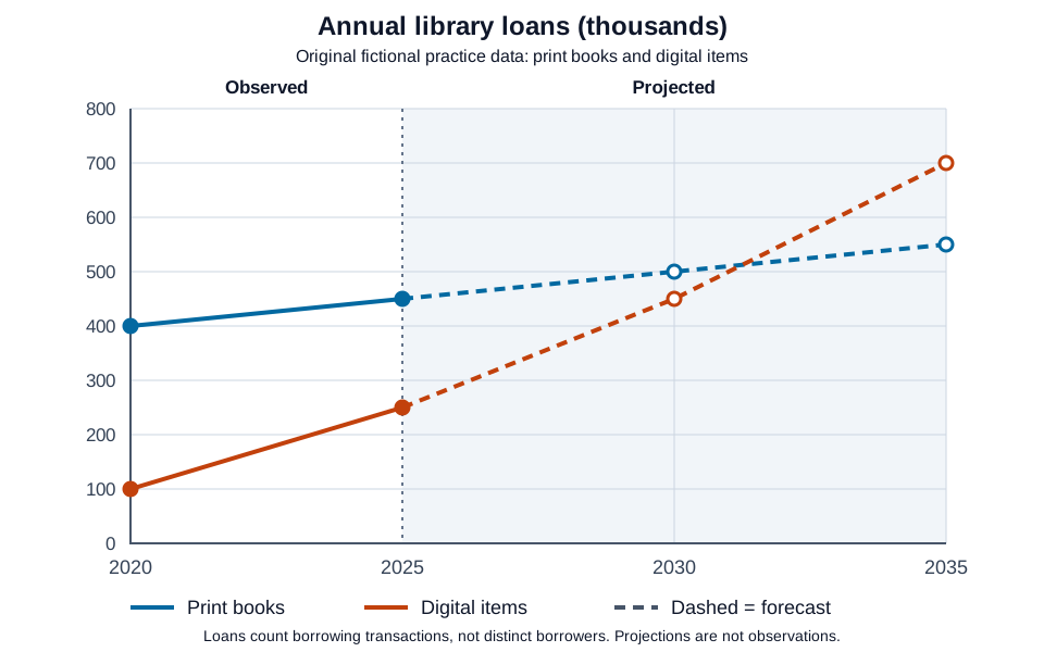
The line graph shows annual loans of print books and digital items from a town's libraries in 2020 and 2025, with projections for 2030 and 2035. Summarise the information by selecting and reporting the main features, and make comparisons where relevant.
Read the chart data as a table
These figures belong to the original English Test Coach practice visual. They are fictional teaching data, not measured statistics about real places.
| Year and status | Print books | Digital items |
|---|---|---|
| 2020 (observed) | 400 | 100 |
| 2025 (observed) | 450 | 250 |
| 2030 (projected) | 500 | 450 |
| 2035 (projected) | 550 | 700 |
Solid lines and filled points show the two observed dates. Dashed lines, open points and the shaded area identify projections after 2025. A value of 400 represents 400,000 loans. These are borrowing transactions, not distinct people; no cause or exact annual crossover date is supplied.
The graph changes status after 2025. Print loans rose from 400,000 to 450,000 between the recorded dates, then are projected to rise to 550,000 by 2035. The later values are predictions within this fictional source. A forecast does not become an observation merely because the calendar later reaches its date.
An overview that preserves the distinction
“Overall, borrowing of both print books and digital items increased during the observed period and is forecast to grow further. Print loans were higher at both recorded dates, but digital loans are projected to become the larger category by 2035.”
One useful detail plan compares the two observed dates first, then the two projected dates. Digital loans are still below print in the 2030 forecast, at 450,000 compared with 500,000, but above it in 2035, at 700,000 versus 550,000. “Are projected to overtake by 2035” keeps both the relationship and its uncertainty clear. “Overtook in 2031” invents an observed event and an exact year.
You can also group by series, provided that you mark the change from observation to projection within each paragraph. Keep the measure intact: 700,000 loans would not establish 700,000 separate borrowers, and no device purchases or changes in library policy are shown.
Repair a forecast claim
Revise: “Digital borrowing became the largest category in 2030 and will definitely keep increasing after 2035.”
Check the forecast revision
“Digital borrowing is projected to remain below print borrowing in 2030, but to exceed it by 2035.” The graph supplies no values beyond 2035 and does not guarantee that either projection will occur.
Try an overview and a numerical accuracy check
- Write a two-sentence overview without figures. Include the overall directions and one change in ranking.
- Describe the Art Gallery’s whole period in one sentence without suggesting that every interval fell.
- Complete: “The City Museum rose from 300,000 ___ 900,000, an increase ___ 600,000.”
- Explain why “The Science Centre overtook the gallery in 2017” is more precise than the labelled observations support.
Check the reasoning
Use “to” for 900,000 and “of” for 600,000 after “an increase”. For the gallery, a suitable sentence is: “Attendance declined overall, falling until 2015 before recovering partly in the final interval.” The Science Centre is lower in 2015 and higher in 2020, but no separate 2017 value is supplied. Describe that change by the final observation instead.
- Does the overview cover the main direction of every series?
- Have you kept thousands distinct from percentages?
- Do the selected figures support a comparison?
- Are any reversals or important ranking changes represented?
- Have you avoided unsupported causes and exact intermediate dates?
For further practice, use the visual-data lesson. Contrast this graph with the single-year bar-chart example, where differences between categories do not establish a trend over time.
Write a report from the original graph
Use the free workspace to plan and draft at least 150 words in about 20 minutes, then compare your selection and accuracy with the sample. Public AI assessment is paused; the planner, timer and word count remain available without an account. The rule-based demo is not an AI score.