By English Test Coach · Updated
All sample answersAcademic Task 1 · 194 words
Museum visitors: selecting the main trends
Describe the supplied chart with an overview, meaningful comparisons and accurate units.
Study the method: Line graphs: select trends and compare figures accurately →
Band 7 goal: Data comparisons
Develop and connect relevant ideas or select and compare the most useful details. This is a study route, not an examiner score assigned to the answer. How IELTS Writing is assessed.
The question
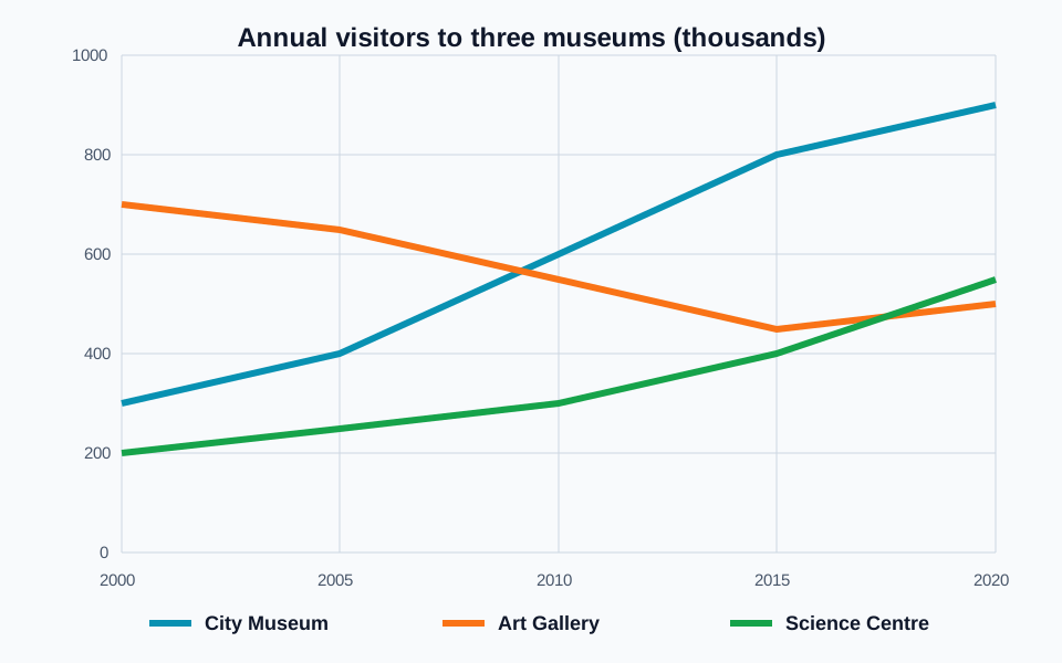
The line graph shows the number of visitors to three museums between 2000 and 2020. Summarise the information by selecting and reporting the main features, and make comparisons where relevant.
 Open full-size diagram (new tab)
Read the chart data as a table
These figures belong to the original English Test Coach practice visual. They are fictional teaching data, not measured statistics about real places.
| Year | City Museum | Art Gallery | Science Centre |
|---|---|---|---|
| 2000 | 300 | 700 | 200 |
| 2005 | 400 | 650 | 250 |
| 2010 | 600 | 550 | 300 |
| 2015 | 800 | 450 | 400 |
| 2020 | 900 | 500 | 550 |
Readings are rounded to the nearest 50 thousand visitors from the graph. For example, 300 represents approximately 300,000 visitors. Compare the overall direction as well as the starting and ending figures.
The sample answer
The line graph compares visitor numbers at the City Museum, the Art Gallery and the Science Centre between 2000 and 2020. Figures are given in thousands, with observations shown at five-year intervals.
Overall, attendance increased at both the City Museum and the Science Centre, whereas the Art Gallery ended the period below its initial level despite a late recovery. The gallery was the most popular venue at the start, but the City Museum attracted the largest number of visitors by the end.
The City Museum received 300,000 visitors in 2000, compared with 700,000 at the Art Gallery. Museum attendance rose to 400,000 in 2005 and then to 600,000 in 2010, when it had overtaken the gallery. It continued to climb, reaching 900,000 in 2020, three times its starting figure. By contrast, the gallery's visitor total fell to approximately 450,000 in 2015 before recovering to 500,000 in the final year.
The Science Centre had the fewest visitors initially, at 200,000. Its numbers increased more gradually, reaching 300,000 in 2010 and 400,000 five years later. By 2020, attendance was approximately 550,000, placing it slightly ahead of the Art Gallery but still well below the City Museum.
Vocabulary in context
Each phrase appears in the answer above. Learn how it works, not just a replacement word.
- at five-year intervals
- With five years separating each recorded point.
Use a hyphen in the adjective five-year; do not pluralise year before intervals.
- three times its starting figure
- A final value equal to the initial value multiplied by three.
This describes 900,000 compared with 300,000, not an increase of 300 percent.
- before recovering to
- Followed later by an increase to a stated level.
To introduces the endpoint; by would introduce the amount of change.
Now make it your own
Write a new overview in two sentences without any figures. Include both the overall trends and the change in which venue was most popular.
For a smaller practice step, use the explanation, knowledge check and self-review exercise in Select and compare visual information.
The practice link opens the original question, not a copy of this answer.
Open the writing workspaceMore examples of this question type
Give an overview of the main patterns and support selected comparisons with accurate figures and units.