By English Test Coach · Updated
Academic Task 1 · Two sources, one coherent report
IELTS mixed charts: connect the main features and keep the measures clear
When a question gives two visuals, first work out what each one measures and what they share. Your report should cover both sources, select useful comparisons and avoid treating a shared date as evidence of cause and effect.
The transport chart, fare table and annotated report below are original fictional English Test Coach teaching material, not recalled exam questions or examiner-scored answers.
Match the categories and dates before comparing
Original question: passenger journeys and fares
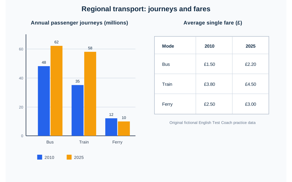
The bar chart shows annual passenger journeys by three forms of regional transport in 2010 and 2025, while the table gives the average single fare for each form in the same years. Summarise the information by selecting and reporting the main features, and make comparisons where relevant.
Read the chart data as a table
These figures belong to the original English Test Coach practice visual. They are fictional teaching data, not measured statistics about real places.
| Mode | 2010 | 2025 |
|---|---|---|
| Bus | 48 | 62 |
| Train | 35 | 58 |
| Ferry | 12 | 10 |
| Mode | 2010 | 2025 |
|---|---|---|
| Bus | £1.50 | £2.20 |
| Train | £3.80 | £4.50 |
| Ferry | £2.50 | £3.00 |
Journeys count trips, not distinct people. Keep the two measures separate: a fare in pounds cannot be added to a number of journeys. Shared years do not establish that price changes caused changes in use.
- Bar chart: annual passenger journeys, measured in millions.
- Table: average single fares, measured in pounds.
- Shared categories: bus, train and ferry.
- Shared dates: 2010 and 2025. Neither visual supplies the intervening annual figures.
This alignment makes it possible to discuss each mode across both sources. It does not make journeys and fares interchangeable. “Bus use reached 62 million journeys” and “the bus fare reached £2.20” describe different quantities.
For another mixed question, check alignment afresh: the visuals might cover different places, dates or populations. Compare only what the labels support. A chart of all residents and a table of students would not automatically share the same population.
Give the reader a main feature from each visual
In the chart, buses retain the highest journey count, while train travel grows most in absolute terms and approaches the bus figure. Ferry journeys decline. In the table, every average fare rises, and trains remain the most expensive mode.
One possible overview
“Overall, buses remained the most used form of transport, although train journeys grew more and almost caught up by 2025. Ferry use declined, while average fares increased for every mode, with trains remaining the most expensive.”
The first sentence establishes the leading category and the narrowing gap; the second includes the exception in use and the common movement in fares. It covers both visuals without listing all twelve figures. “Overall, transport changed considerably” would be too vague, and an overview about journeys alone would omit the table’s main pattern.
The words “while” and “although” can place contrasting observations together. They do not need to imply that one observation explains the other.
Organise the detail around a useful comparison
A clear plan: journeys, then fares
In the first detail paragraph, compare bus and train journeys across the two years, then contrast the ferry decline. In the second, compare fares and the size of their increases. Each paragraph keeps one unit in view.
This works well here because all journey counts use millions and all fares use pounds. The complete transport report follows this approach.
An alternative: the two larger modes, then the ferry
You could group buses and trains, covering journeys and fares for both, then contrast the ferry. This highlights the two growing modes against the declining one.
If you choose this structure, signal each change of measure explicitly. “The train figure rose to 58 and then to 4.50” confuses two quantities; “Train journeys reached 58 million, while the average single fare reached £4.50” keeps them distinct.
Neither plan is compulsory. Choose the structure that makes comparisons easy to follow; do not spend one paragraph describing colours, bar positions or the table layout.
Develop a comparison instead of listing values
“Train journeys rose from 35 million to 58 million, an increase of 23 million, compared with a 14-million rise in bus journeys. The gap between the two modes therefore narrowed from 13 million journeys to four million.”
The arithmetic is visible: 48 − 35 = 13 initially and 62 − 58 = 4 later. “Therefore” explains that numerical relationship. It does not claim why travellers changed their behaviour. The train figure remains below the bus figure at both dates, so “trains overtook buses” would be inaccurate.
In the fare paragraph, bus and train prices both rise by £0.70, while the ferry increase is £0.50. Equal cash increases do not mean equal percentage increases because the starting fares differ. Reporting the pound changes is sufficient here; there is no need to calculate a growth rate for every value.
Keep the conclusions within the evidence
Journeys are not unique passengers
The bus figure of 62 million counts journeys in a year. One commuter may make many journeys. Write “62 million bus journeys”, not “62 million different people used buses”. The source does not provide a population or a count of individual travellers.
Two dates do not show a continuous path
Train journeys are higher in 2025 than in 2010. That supports an increase between the endpoints, but not “rose steadily every year”. There may have been fluctuations that the chart does not show.
A simultaneous change is not a proven cause
“Ferry use fell because its fare increased” goes beyond the source. Every fare rose, but bus and train journeys also rose. The data do not isolate price effects or describe service quality, new routes or travellers’ reasons.
A supported sentence is: “Ferry journeys fell from 12 million to 10 million, while the average single fare rose from £2.50 to £3.00.” It reports the contrast without inventing an explanation. You do not need to speculate about causes to make the report interesting.
Repair a report that mixes quantities
“Trains became the most popular option, reaching 58 million people. Bus and train fares rose at the same percentage rate, and higher ferry prices caused its decline.”
Identify the four unsupported or inaccurate claims, then rewrite the extract using only the chart and table.
Compare a corrected extract
“Train journeys reached 58 million in 2025, still below the bus total of 62 million. Bus and train fares both increased by £0.70, although their starting prices differed. Ferry journeys declined as its fare rose; the visuals do not establish a causal connection.”
The revision corrects the ranking, counts journeys rather than people, states the equal cash increase without claiming equal percentage growth, and removes the unsupported cause.
- Have you identified both visuals and their measures?
- Does the overview cover important features from each?
- Are changes and gaps calculated within the same unit?
- Have you kept endpoint differences distinct from a continuous trend?
- Does each claim come from the source rather than an assumed explanation?
Use the bar-chart guide for category comparisons or the table-report guide for row and column comparisons. The visual-data lesson gives a shorter overview exercise.
Write a report covering both original visuals
Plan an overview and two focused detail paragraphs, then draft at least 150 words in about 20 minutes. Public AI assessment is paused; the free workspace provides the planner, timer and word count without an account. The rule-based demo is not an AI score.