By English Test Coach · Updated
All sample answersAcademic Task 1 · 248 words
Regional transport: connect journeys and fares
Link a passenger-volume chart with a fare table while keeping units separate and avoiding an unsupported causal claim.
Study the method: Mixed charts: cover both visuals and keep their units clear →
Band 7 goal: Data comparisons
Develop and connect relevant ideas or select and compare the most useful details. This is a study route, not an examiner score assigned to the answer. How IELTS Writing is assessed.
The question
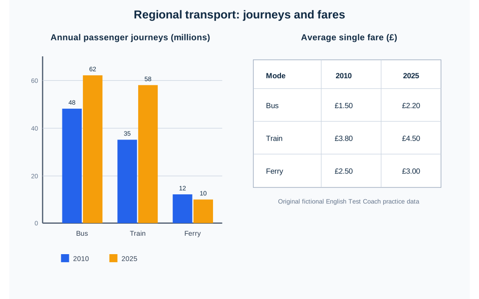
The bar chart shows annual passenger journeys by three forms of regional transport in 2010 and 2025, while the table gives the average single fare for each form in the same years. Summarise the information by selecting and reporting the main features, and make comparisons where relevant.
 Open full-size diagram (new tab)
Read the chart data as a table
These figures belong to the original English Test Coach practice visual. They are fictional teaching data, not measured statistics about real places.
| Mode | 2010 | 2025 |
|---|---|---|
| Bus | 48 | 62 |
| Train | 35 | 58 |
| Ferry | 12 | 10 |
| Mode | 2010 | 2025 |
|---|---|---|
| Bus | £1.50 | £2.20 |
| Train | £3.80 | £4.50 |
| Ferry | £2.50 | £3.00 |
Journeys count trips, not distinct people. Keep the two measures separate: a fare in pounds cannot be added to a number of journeys. Shared years do not establish that price changes caused changes in use.
The sample answer
The bar chart compares the annual number of passenger journeys made by bus, train and ferry in a fictional region in 2010 and 2025, measured in millions. The accompanying table presents the average price in pounds of a single journey on each form of transport in the same two years.
Overall, bus travel remained the most widely used mode, although train use grew more sharply and almost reached the bus figure by 2025. Ferry journeys were the only category to decline. Average fares rose for all three modes, with rail remaining the most expensive and bus the least expensive in both years.
Bus use increased from 48 million journeys in 2010 to 62 million in 2025, a rise of 14 million. Train travel grew by 23 million, from 35 million to 58 million, and therefore narrowed the gap with bus travel from 13 million journeys to just 4 million. By contrast, the ferry total slipped from 12 million to 10 million and remained far below the other two modes.
A similar upward pattern did not occur in ferry use, but every fare shown in the table became higher. The average single fare for buses rose by £0.70, from £1.50 to £2.20, while the train fare also increased by £0.70, from £3.80 to £4.50. Ferry travel recorded a smaller rise of £0.50, reaching £3.00 in 2025. Although the passenger and fare data cover the same years, the visuals do not establish that changing prices caused the differences in demand.
Vocabulary in context
Each phrase appears in the answer above. Learn how it works, not just a replacement word.
- narrowed the gap
- Reduced the numerical difference between two values.
State the values or size of the gap so the comparison can be checked against the visual.
- average single fare
- The average price of one one-way passenger journey.
Keep the currency with the fare and do not treat it as a return ticket or total revenue.
- do not establish
- Do not provide enough evidence to prove a claimed relationship.
Use this limitation when two visuals share dates but provide no evidence that one variable caused the other.
Now make it your own
Write a two-sentence overview joining both visuals. Then compare train and bus use without fares, followed by all three fares without suggesting that price caused passenger growth or decline.
For a smaller practice step, use the explanation, knowledge check and self-review exercise in Select and compare visual information.
The practice link opens the original question, not a copy of this answer.
Open the writing workspaceMore examples of this question type
Give an overview of the main patterns and support selected comparisons with accurate figures and units.